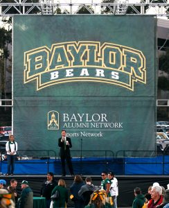
No matter the purpose of your outdoor banner, it’s something that should have an effective message and design in order to appeal to your viewers. There are many factors that go into making a great outdoor banner, and because they will likely be viewed quickly and from a distance, there are certain design elements that need to be emphasized in order to translate your message. In this blog, we’re going to go over some tips for designing effective outdoor banners.
The Message
Before getting into the logistics of your banners, you’re going to want to start with your intended message. There are many different uses for outdoor banners, including but not limited to:
- Campus logos or school name
- Upcoming sports or entertainment events in your community
- Communicating with your customers
- Seasonal changes (fall, spring, winter) or upcoming holidays
You’re going to want to keep your message on the simple side, as you want to communicate your message in the time people are driving or walking by. Also, if you have too much going on in your banner, it can be jumbled and readers might not see the important information, so be sure to include only the necessary information you need to convey your message.
Banner Placement
If you already have your message and design in mind, you might want to consider thinking about the intended placement of your banner before making any concrete decisions. The placement of your banner is likely to affect your color scheme and other design-related aspects of your banner, so it’s important to know where your banners are going, and design based on the environment they will be in. This can help ensure your banners will stand out and contrast with the area it’s in for a more effective view.
Bold and Readable Font
There are many different fonts you can choose from when it comes to designing your banners, so picking the right one is going to make your banners that much more effective. The size of your banner is also going to influence how big your font needs to be, so the important information doesn’t get lost by being too small proportionally. Bold, readable font can make all the difference in your banner design; it might help to find some examples you think would work well with your banner, and take your time picking one.
Keep Your Brand In Mind
In addition to font and other design elements on your banners, it’s important to keep your brand in mind through the entire design process. Your readers should know who the message is coming from, so be sure to include your name or logo in a designated spot on your banner. This will also help you determine your color scheme. Schools or universities, for example, might want to stick with their campus colors depending on the message of your banner.
High-Quality Graphics and Photos
Depending on the type of message or information you want to display, you might include graphics or photos in your banner. Images can act as a focal point for your banner, so it’s important that the images or graphics are high quality to help draw attention. They can also help communicate your message, and therefore limit the amount of text needed on your banners.
Outdoor Banners at Material Promotions
Material Promotions is an expert, large-format graphics production company offering both screen printing and digital output capabilities on a wide array of custom products. With our combination of talented designers and materials, we can deliver you high-quality, durable, and unique banners for any occasion.
Call for Your Free Quote
Contact us with details about your project to receive a quote. We offer free consultation on project scope and implementation as well as free samples of printed products and raw materials. Need help with your layout? Material Promotions offers free graphic design services to our retail customers!
